WHY DOES ALEXANDER LIBERMAN still matter sixteen years after his death? For anyone under thirty and not in the magazine business the name will likely mean little, certainly not loom large as the grand master who instilled both awe and fear and sometimes both.
Alexander Liberman was art director of Vogue for twenty-one years, eventually becoming editorial director of Condé Nast for another thirty-two years. During that period, 1962 to 1994, he was responsible for the look, style (often content) and sometimes creation of Allure, Condé Nast Traveler, Details, Glamour, House & Garden, Mademoiselle, Self, Vanity Fair and, of course, Vogue. A sculptor, painter, photographer, printmaker, designer, editor and writer, Liberman embraced many lives in one.
Liberman was born in Kiev, Ukraine, in 1912, (he remembered the first days of the Bolshevik upheaval in 1917), was educated in Russia, and then sent to boarding school in England where he acquired, by age ten, the genteel demeanor and slight British accent that would later become his trademark. The story goes that the Libermans were able to leave Russia with Lenin’s help: from there they went to France. Liberman’s early career in design was somewhat diverse: he studied painting with André Lhote, architecture with Auguste Perret, and was briefly employed by the painter and designer Cassandre. In 1933, aged eighteen, he started his publishing career in Paris with the early pictorial magazine VU, a formative time where he worked with photographers such as Brassaï, André Kertész, and Robert Capa. Although the French pictorial weekly was published only for the twelve years between 1928 and the fall of France in 1940, it was enormously influential, especially in America, when photographic essays came to prominence in magazines such as Life and Look. VU capitalised on the explosion of news agencies newly able to distribute photographs worldwide.
Liberman spoke of his time at VU, and the way the magazine was made: ‘Since there were no photostats in those days, every picture had to be projected onto the layout to get the right size. The idea of photomontage could have come from this very easily. When you projected a negative or a positive over another picture, you got ideas, and this was the only way I thought of illustrating articles or covers.’1 Liberman’s ability to get ideas from process or ‘mistakes’ stayed with him throughout his life, serving him both in his studio and in the offices of Condé Nast.
The occupation of France by Hitler’s army in 1940 forced Liberman’s fate: he emigrated to New York the following year along with the indomitable Russian milliner, Tatiana (who later became his wife) and her small daughter, his stepdaughter, the writer Francine du Plessix Gray. Always well-connected, Liberman almost immediately began working for Condé Nast and became the rising star in the Vogue art department. A short time later replacing the art director at Vogue and reaching the exalted role of editorial director, where he stayed until 1994.
Liberman always insisted that magazines had to be readable. Readable? The magazines he supervised during his fifty-plus-year career at Condé Nast had distinctively crowded, messy layouts; page after page incorporated jumbled montages of text and images. He had a unique role at the company: he was responsible for the magazine’s look yet he was freed from any financial constraints by publisher Si Newhouse’s deep and generous pockets. He had no accountants or marketers breathing down his neck, nor any focus group to heed – he appeared to be able to do whatever he wanted: he was quintessentially both a free spirit and 100% the company man.
Liberman’s biographers Dodie Kazanjian and Calvin Tomkins describe his role, ‘nobody could really define the full extent of what Liberman did at Condé Nast the absolute authority of his eye, his taste, his critical judgment, and his creative energy reached throughout the empire, affecting everything from picture captions to corporate decisions. Newhouse was not alone in thinking him a magazine genius, someone ideally equipped in mind and temperament to orchestrate the monthly seduction of twelve million readers.’2
Each of the magazines in Liberman’s portfolio had a planning room with a light box for viewing transparencies, a long, high desk and a pin board on which layouts were arranged so the flow of the whole issue could be seen easily. It was here that Liberman, surrounded by admiring staff, would swoop in and do his magic. It was performance: some editors remember this procedure as jazz, others as a poem, and few as warfare. Whatever the metaphor, most were in awe. In this process, busy hands prepared multiple photostats of each image – there might be more than a dozen – which lay in neat little paper-clipped piles, with headline type in various sizes, all at the ready. Liberman would work quickly as he quizzed the editors about the content to get to the article’s essence. It was important to him to approach a layout with the same disadvantage as the reader.
Liberman’s determination for history to disregard his day job and to remember him solely as an artist – which he became at weekends – was part of the great secret of his dazzling success at Condé Nast. ‘What is Vogue but a silly fashion magazine.’ he once told me. Could he really believe this? Whatever the truth, this detachment gave him a light touch and the freedom that comes with that: he was unshackled by loyalty or sentiment, and his impatience and seeming low regard for his Condé Nast work also meant that he didn’t second-guess himself. He liked to work decisively and with speed, which often attracted the unexpected. Laying out the pages of a magazine was a creative act and a physical one too. Liberman loved torn paper, delighting in the uncertainty of the tear. He could just as easily crop a great photographer’s image in half as he could dismiss a legendary editor or savage copy. Nothing was sacred, everything was sacrificed for what was new, or ‘modern’, which was a favourite word. Liberman’s Russian/European background gave him a hold on culture, while his American self readily embraced everything else.
Liberman ruled during a golden age of magazines and at a time when advertising thrived. It’s almost inconceivable to imagine a similar figure as unbeholden as he was to business and the bottom line. Yet Liberman was, as his biographers describe, ever ‘alert to every nuance and shift in the culture at large.’3
Inspiration:
Liberman got ideas from everywhere: from high, as well as low culture. He once told me how he would show a photographer a picture of the ‘Winged Victory of Samothrace’ for inspiration, though it amused him that the statue has no head.
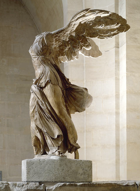
Perhaps these Henry Clark pictures for Vogue were the outcome of such discussion.
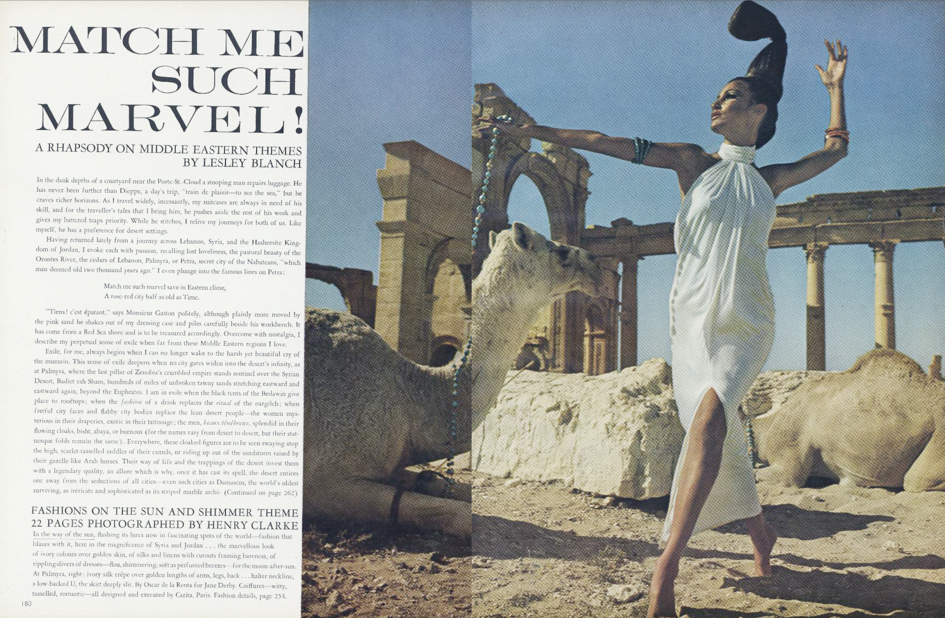
Liberman loved film (and television) – you can see the cinematic qualities in his layouts: there’s pace, scale, sequence, story-telling, impact and fantasy.
Women:
While Liberman was at Condé Nast, the other great twentieth-century art director across town – also a Russian – Alexey Brodovitch, was working at Harpers Bazaar in a very different way. Liberman said of his rival ‘he was making the magazine attractive to women, not interesting to women.’4 Brodovitch was preoccupied with the graphic look of the page, where women in dresses were shapes. Liberman, by contrast, was more carefree, he commissioned images of real women doing real things, breaking from the culture of stiff society women that had previously been Vogue’s domain.
This approach, which embraced informality, is seen in Norman Parkinson’s cover of a woman with shopping. The model appears carrying groceries in a brown bag, but is still wearing gloves and a hat with a veil.
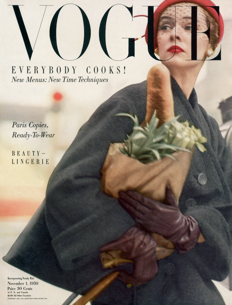
Liberman championed women on the page and off: his brilliant 1994 brief when we created Allure – a beauty magazine – was to ‘make it modern, beautiful and journalistic.’ Liberman instinctively understood that the business of beauty wasn’t necessarily beautiful and that modern women would respond to something more immediate.
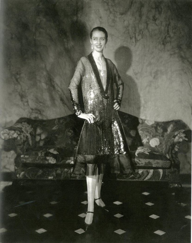
Liberman was interested in pictures of people – not photographs of dresses – the photographers he admired, greats like Edward Steichen and Walker Evans, took pictures like this. He would show young photographers Steichen’s picture of Marion Morehouse and say ‘A fashion photograph is not a photograph of a dress; it is a photograph of a woman.’5
Layout:
Liberman told me he liked to ‘mentally spit on the image.’ In many of his Vogue layouts you can see an effort to throw out the obvious and let something more exciting in, even if it wasn’t perfect. He did things with photographs fashion media wouldn’t dare do now, he’d distort, obscure, polarise, mix and crop an image, things that today would ensure no photographer works with you again. Though Liberman’s layouts were at times deliberately messy, they were never confusing. He would strive to shock readers, but never intimidate them. As a result, the magazines he designed were approachable and thus readable. He made sure readers could instantly identify with the pages of his publications: a glance at the layout was all one needed to grasp the essence of an article. ‘Clarity and strength of communication is what interests me,’ said Liberman.6
Journalism:
‘At Vogue I wanted to break the design obsession,’ Liberman said, ‘so I defended a more journalistic approach – rough lettering, no whitespace, crowded pages, messier layouts.’7 This approach was also reflected in his choice of reporters and photographers too, many of whom were women.
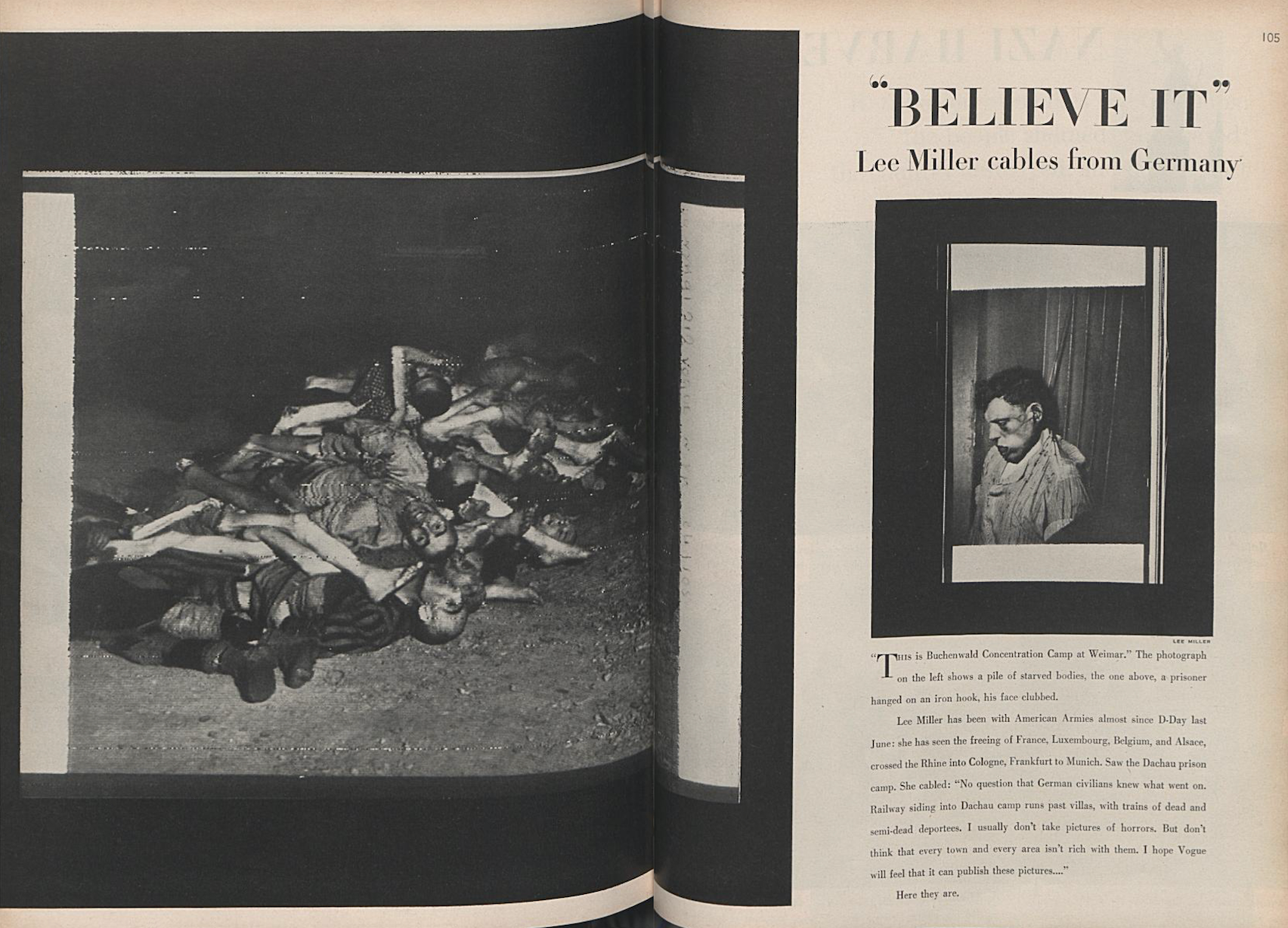
A lasting example of this approach are the extraordinary pictures Lee Miller shot of the newly liberated Buchenwald death camp which Liberman emphasised with heavy black frames on the page. In a return-to-normal, this ground-breaking story was immediately followed by a round-up of spring hats!
Art:
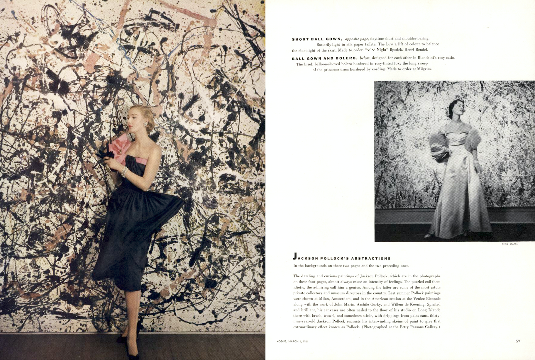
Liberman was passionate about bringing culture to the pages of Vogue partly because he was interested in art – in being an artist – but also because he wanted readers to be interested in art too. Liberman was very proud of getting Jackson Pollock into Vogue with Cecil Beaton’s 1951 story, albeit there was fashion in front of the paintings.
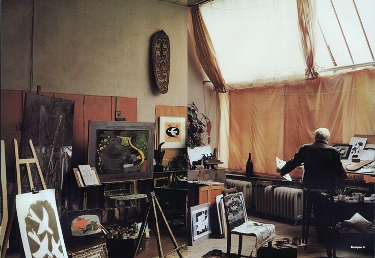
Every summer Liberman and his family would travel to Europe where over the years he would photograph many of the great artists of the twentieth century. He published his photographs, originally in black and white, in a book called The Artist in His Studio.
Irving Penn:
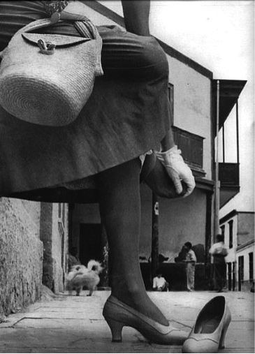
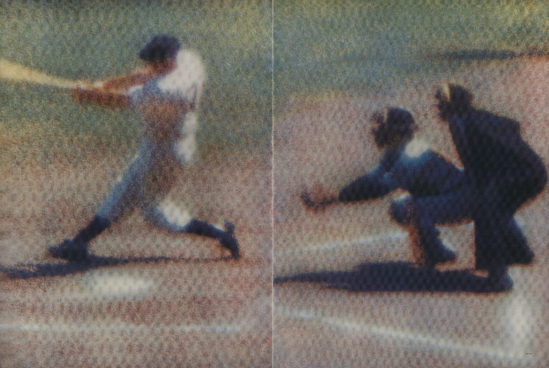
Liberman had a long and enduring relationship with Irving Penn. The perfectionist photographer would frequently complain he’d never work for Vogue again if Liberman published a picture that wasn’t one of his choosing, but Liberman would go ahead and publish it anyway. Liberman even famously used a Penn image that was out of focus and blew it up to cover a spread.
For one story Penn, who rarely went on location, shot in Lima and returned with one picture where the model had sore feet and taken off her shoes: Liberman called these pictures ‘the imperfection of actual life.’8
Penn said Liberman taught him that ‘image was an accident.’9 Liberman had long been interested in the accident or chance: ‘I came to believe in the unexpected, in chance, in doing things that haven’t been done before and didn’t conform to any established design principles.’10
***
Liberman died in 1999. He had survived retirement for five years claiming to love this new-found leisure that left him free to explore exotic new experiences like walking round a shopping mall. Modern to the end.
Lucy Sisman is a writer and creative director based in New York. She worked alongside Alexander Liberman to create Allure magazine and co-authored the publication Alex Liberman: Ways of Thinking About Design with Véronique Vienne.
VU: The Story of a Magazine by Michel Frizot & Cédric de Veigy ↩
Alex: The Life of Alexander Liberman by Dodie Kazanjian and Calvin Tomkins, Knopf, 1993. ↩
Alex: The Life of Alexander Liberman by Dodie Kazanjian and Calvin Tomkins, Knopf, 1993. ↩
Introduction to Vogue Book of Fashion Photography 1919-1979, by Polly Devlin, New York 1979 ↩
Introduction to Vogue Book of Fashion Photography 1919-1979, by Polly Devlin, New York 1979 ↩
Alex: The Life of Alexander Liberman by Dodie Kazanjian and Calvin Tomkins, Knopf, 1993. ↩
Alex: The Life of Alexander Liberman by Dodie Kazanjian and Calvin Tomkins, Knopf, 1993. ↩
Alex: The Life of Alexander Liberman by Dodie Kazanjian and Calvin Tomkins, Knopf, 1993. ↩
Alex: The Life of Alexander Liberman by Dodie Kazanjian and Calvin Tomkins, Knopf, 1993. ↩
Alex: The Life of Alexander Liberman by Dodie Kazanjian and Calvin Tomkins, Knopf, 1993. ↩